Hi All,
Well, this is somewhat unexpected but even I cannot ignore the recent arrival of Windows 8 preview. Microsoft has created so much hype and rumors about their new OS that even I had to go against my rule – “Never come near Microsoft beta products” – and check it out. Before this release there were many speculations about which direction Microsoft is going to take. Most of those were based on a 4 minute video and various presentation shown in conventions (and a certain leaked build that could be found on the torrents). I heard ludicrous things like “Microsoft has rewritten the entire OS in JS and HTML 5” and somewhat worrying assumptions that .Net will no longer be supported. From looking at the preview version of Windows 8, the vast majority of these rumors and speculations is not at all close to reality.
Here is a summary of my very brief experience with Windows 8. Note that I might missed important things so you can always mention them in the comments.
Installation
The installation was quite simple. I installed Windows 7 on another machine just a couple of days ago and I must say that the Windows 8 installation is much shorter and doesn’t require restarts. Nevertheless, it looks exactly like the installation of Windows 7 (at least until the post installation steps). At the beginning the installation asked if I want to upgrade my existing installation which was interesting since I was installing on a clean machine. In the post installation I was asked to enter my Live ID and after I did everything was connected and my Windows user was my Live ID. I think it is safe to guess that in the real version they will have a way to create a regular user and connect to domains (at least for the Enterprise versions).
The new UI
Once you log on to the new Windows you are immediately thrown into the new Metro UI.

It looks and feels very nice and it is easy to find and activate each application. Although there was one thing that bothered me. It seems that it wasn’t designed for a mouse control because you cannot drag it left and right (I hope this will be added in the release). Instead you can use a small scrollbar on the bottom of the screen or the mouse wheel to scroll. As you can see in the screenshot, Metro style applications may use the new Tiles API while other application get a default tile that shows the application name and title. I tried to run some Metro applications and found nothing really special about them. They run on full screen without windows and have a common menu style that is similar to Windows Phone and can be activated by a right-click. There was one annoying thing that I experienced. It seems that Microsoft designed the applications for tablets or something because for the hell of me I couldn’t find an “Exit” button anywhere! Eventually I had to close each application using the Task Manager since Alt+F4 didn’t close them either (and trust me I know how to exit VI

The Old UI
The nice surprise comes when you click the Desktop tile (or Windows button or Windows + D that still works). You are flung into the familiar Windows desktop (using a strange Skew effect from the 90’s which, I hope, can be somehow modified) and there you can see some subtle changes that I feel will make working with Windows somewhat simpler. As published, the Ribbon has spread into the Windows Explorer and all the important functions were externalized. This makes work somewhat simpler since you don’t need to rely on the context menus or the hidden main menu so much.

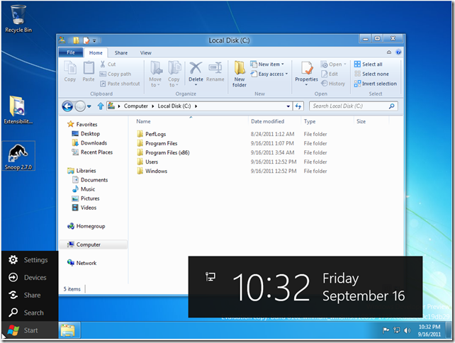
There is still a strange Start button which, when clicked, throws you back into the Metro UI. Sometimes it shows this (see screenshot) ugly black menu and huge time display when you hover over it (sometimes it shows the very important tooltip “Start”).
An even nicer surprise was the new Task Manager (which I had to use quite a lot, see previous section) which has a brand new UI that shows all the important information in a nice colorful way. You can now easily see all the significant counters and have easy access to the Performance UI (which was hidden in Windows 7) and the graphs. Other than that the UI felt unchanged from Windows 7 in both the look and feel and the behavior.
Visual Studio Express (Preview Edition)
I tried out the new Visual Studio (a.k.a. vNext) and didn’t find any surprises there (although this is the Express version and I didn’t want to install the Ultimate version, yet). It looks exactly like VS2010 with no apparent significant changes. I think the most important change is that they finally cleaned out the default toolbars and left only the most important commands there. Other than that, from what I could find from my short experience with vNext, the major changes are:
- Moved the Quick Access window (Control+3 in VS2010) to a static toolbar item.
- Renamed Solution Navigator to Solution Explorer (I think the original Solution Explorer was removed).
- Removed Quick Find.
In the short time I tested vNext I tried to create a small Metro application in WPF. Couldn’t see anything new here. There were some strange things (a project that has no references but still compiles with no problems) but everything seems to work as I am used to. By the way, I couldn’t find an “Exit” button on the default template of the Metro application either. Which makes me believe that there is some key I can click to close the applications.
Conclusion
From my very brief experience with the new Windows 8 I can say that there are quite many new things and concepts but it is certainly not a revolution. The Metro UI looks promising for the average user but it seems to target mostly tablets and not regular PCs that still use keyboard and mouse to interact with the interface. Once you go back to the Desktop the experience is not much different than Windows 7 except for the many UX improvements and additions. As a developer I didn’t find anything interesting in vNext but I checked only this Express Preview version and there are probably some surprises hiding inside (at least I hope so). I am looking forward to see what Microsoft has in its sleeve for the release.
Have a nice day,
Boris.
P.S.
This blog post was written on my Windows 7 PC.